Project Description
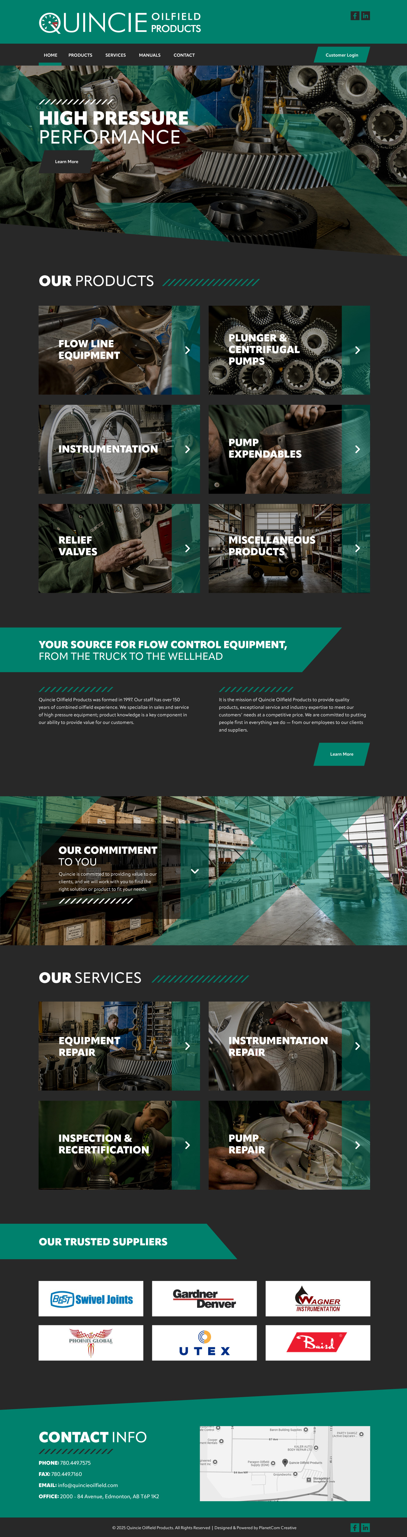
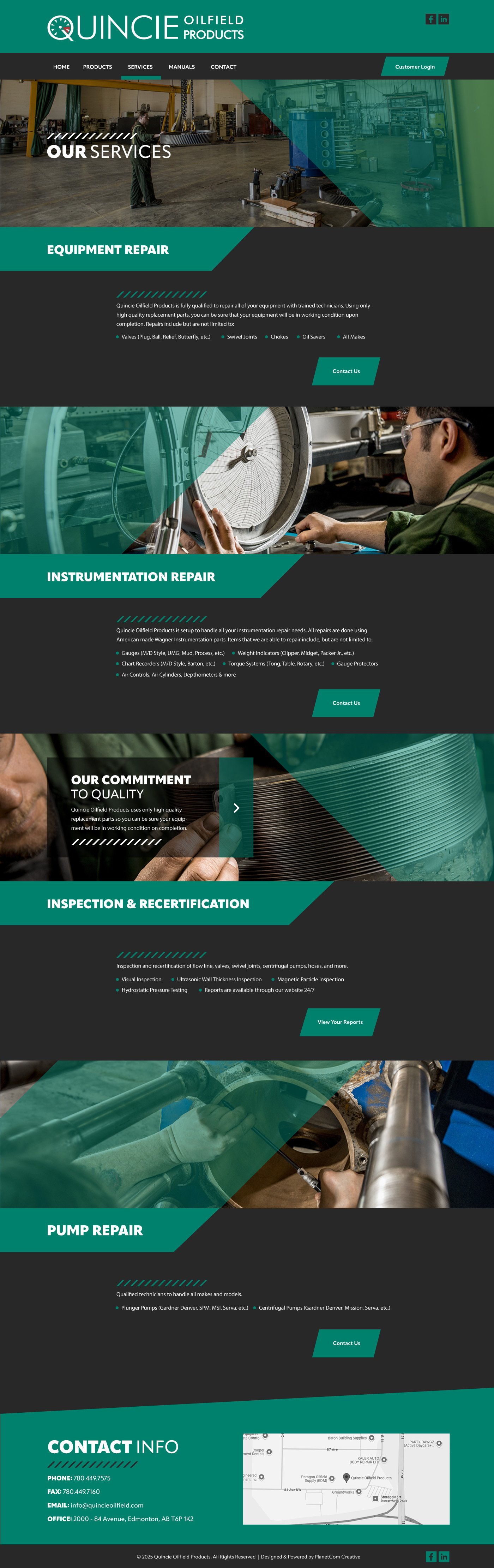
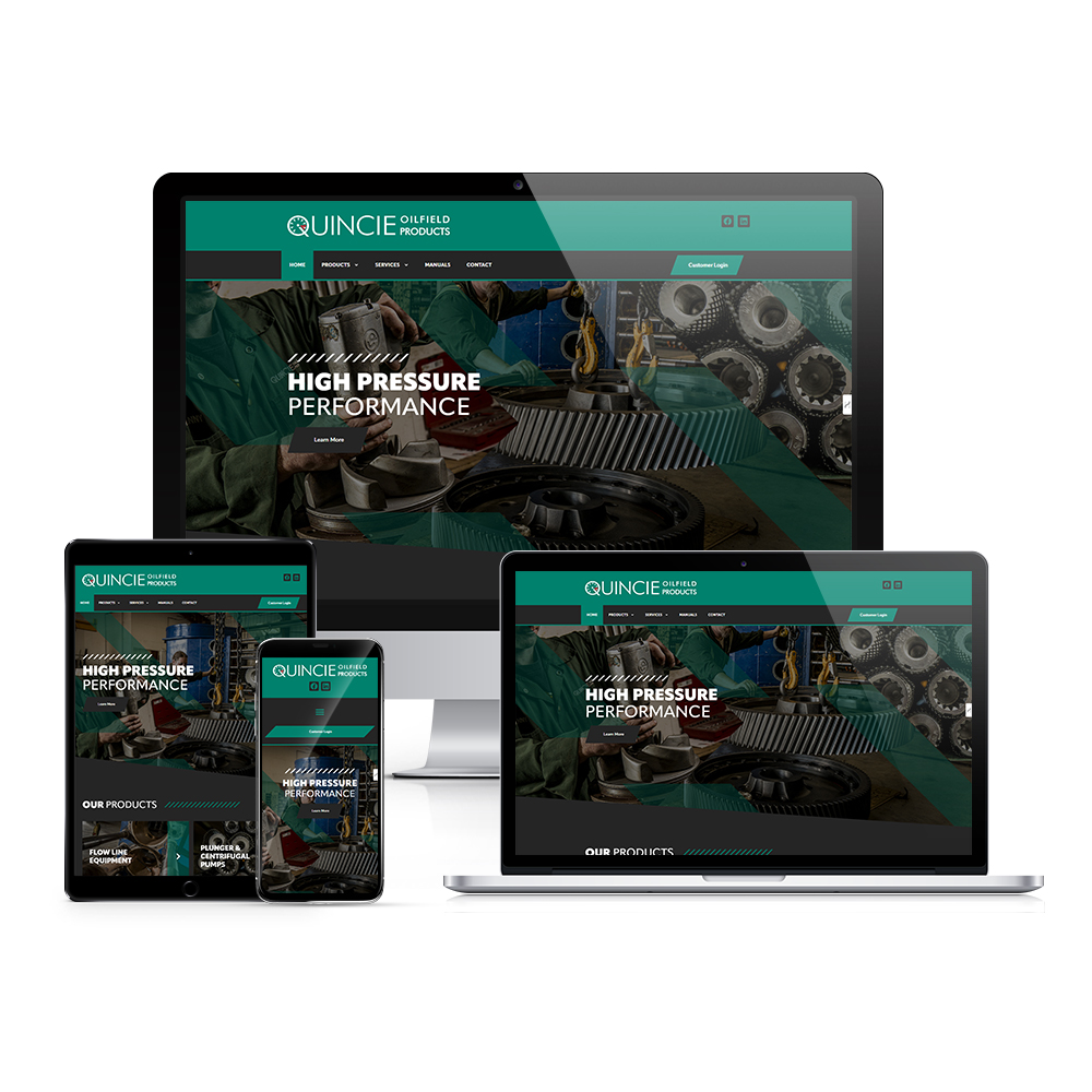
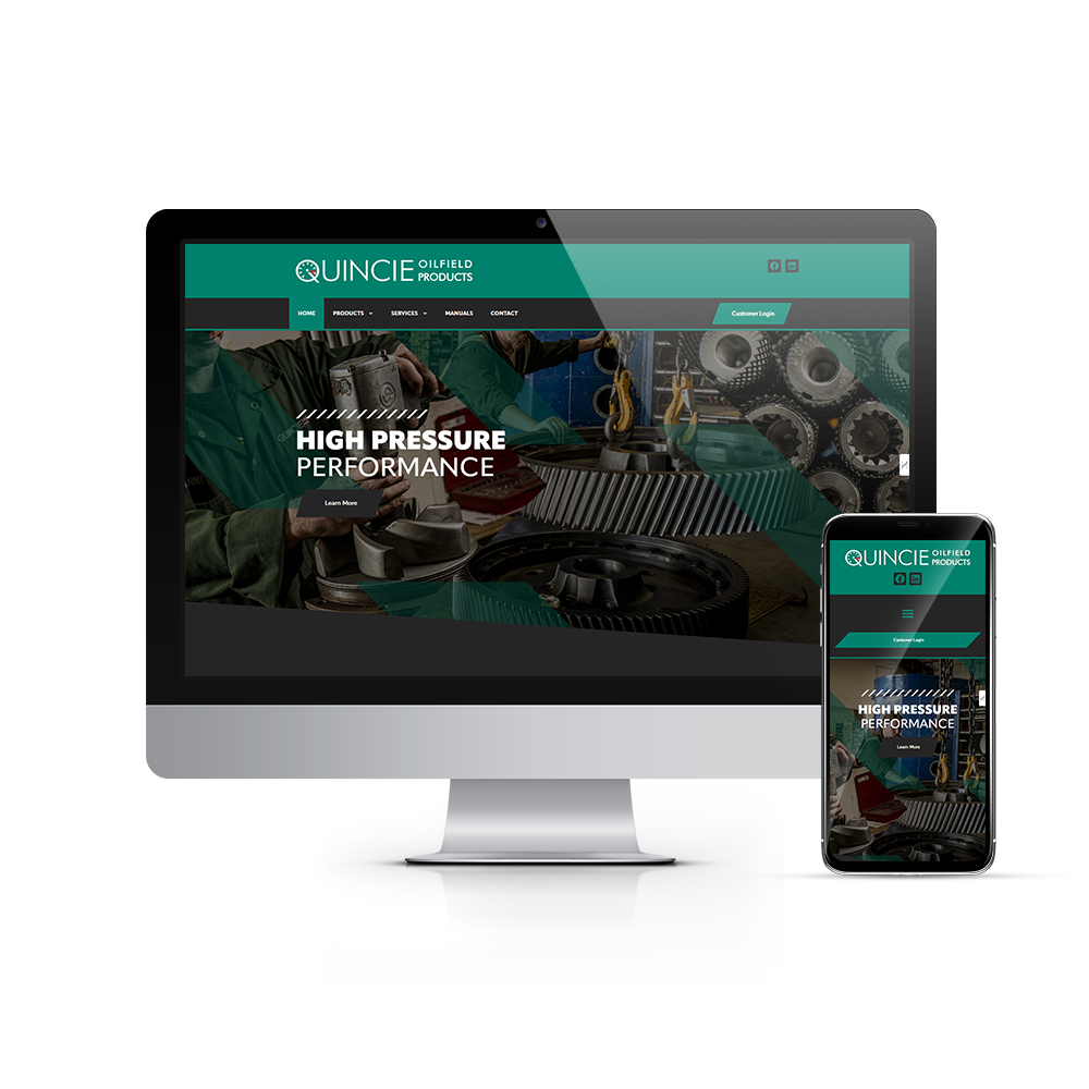
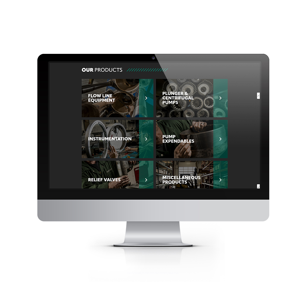
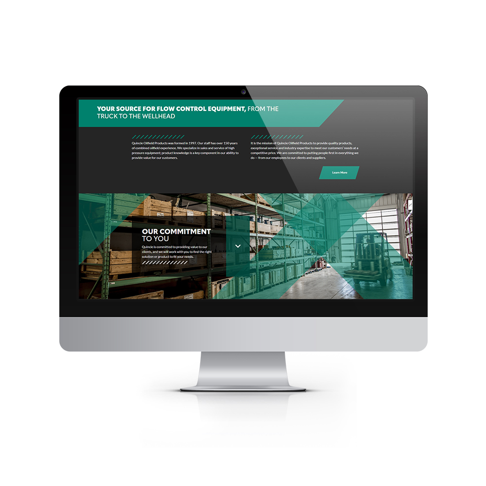
Quincie Oilfield Products approached us to breathe new life into their website and bring it into the modern era. Industrial/Trade sites can be a bit tricky to make stand out design-wise, but fortunately we had our work cut out for us due to some strong existing branding and marketing materials that paved the way and led us in the right direction from the get-go.
One item that proved invaluable during the design phase of this project was a printed brochure they had gotten done years ago. Far from outdated, the design, branding, and photography were on-point and gave me a much-needed head start. I am very grateful that the fine folks at Quincie see the value in high-quality photography, and even had an additional onsite photo shoot done to help elevate the aesthetics of the site and really take things to the next level. No stock and/or AI generated placeholders here! That, combined with an elegant colour scheme that leans heavily onto the dark side, made this a standout project for me, with the end result being one of my favourites in recent memory.
*Designed & developed while working at PlanetCom Inc.
Tools Used